W.I.P. Fonts
Type Design Development
On the side, I have been chipping away at a number of font ideas for a number of years. They are still works of progress so if you have some tips for me, hit me up!
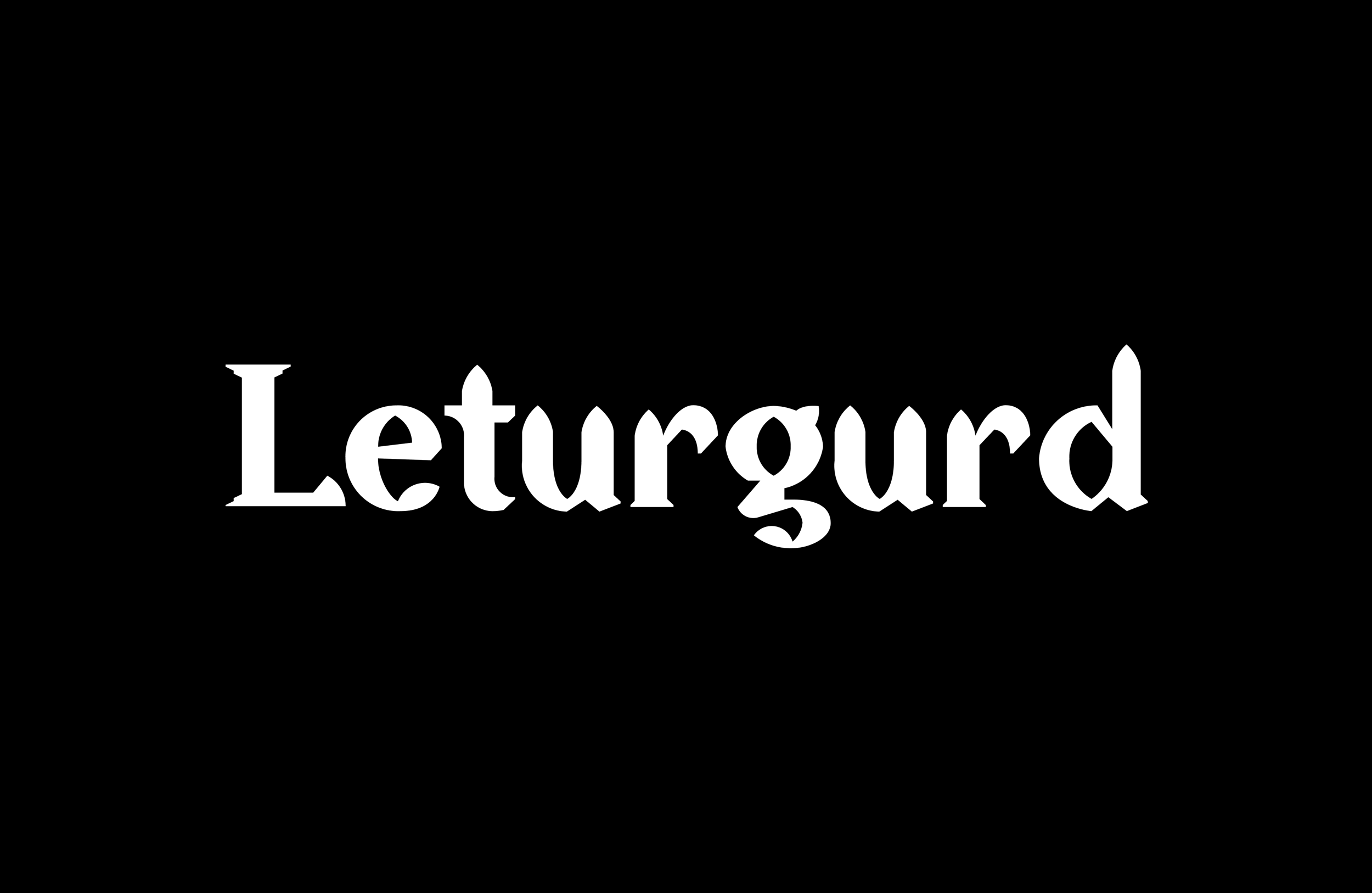
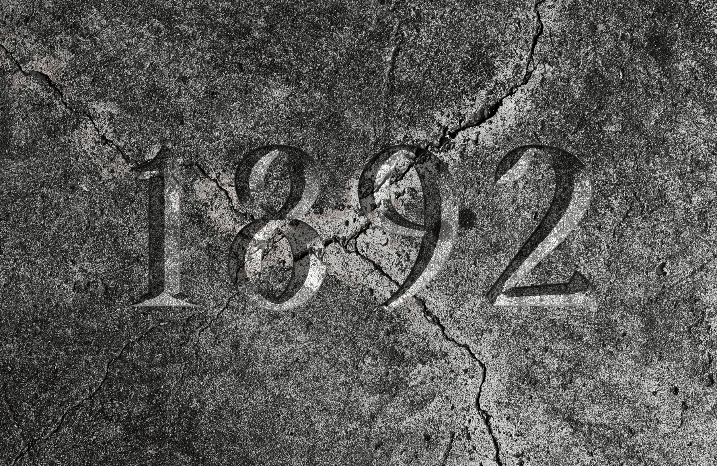
Leturgurd
Whilst at the church in Reykjavik I was inspired by the contrast in the shapes of the building from the outside to the inside, and I was excited to try and translate that to the characteristics of characters.


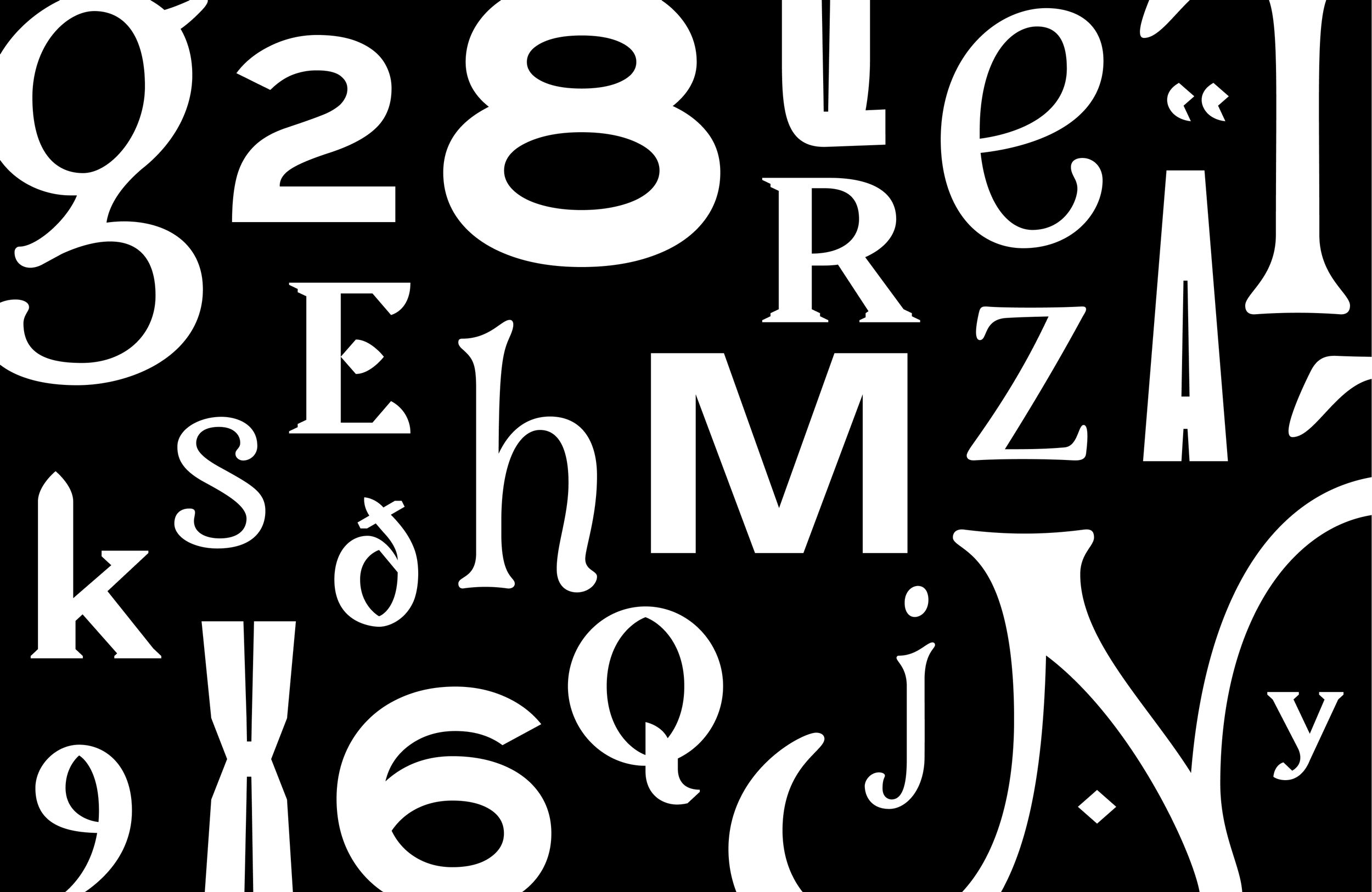
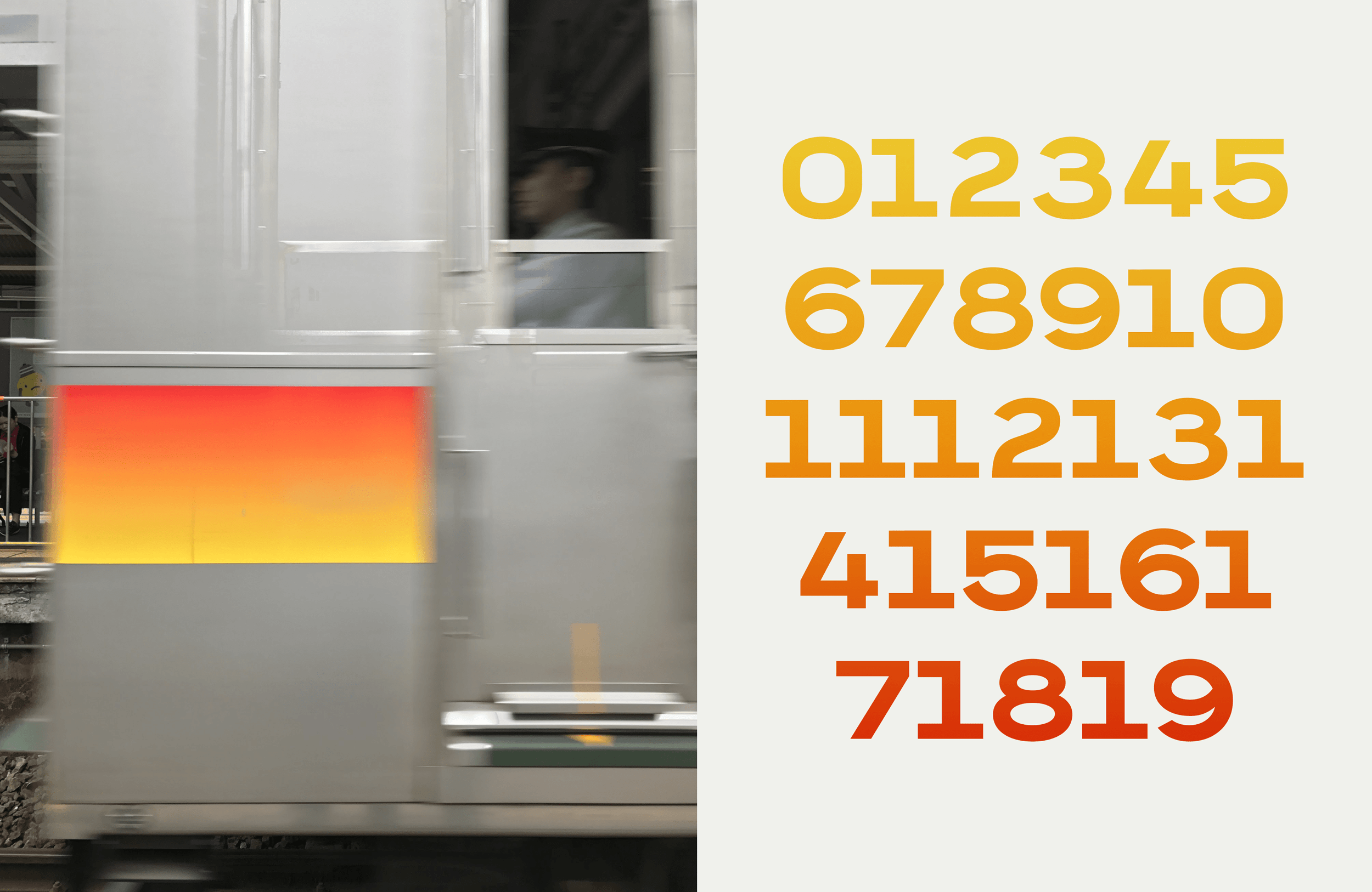
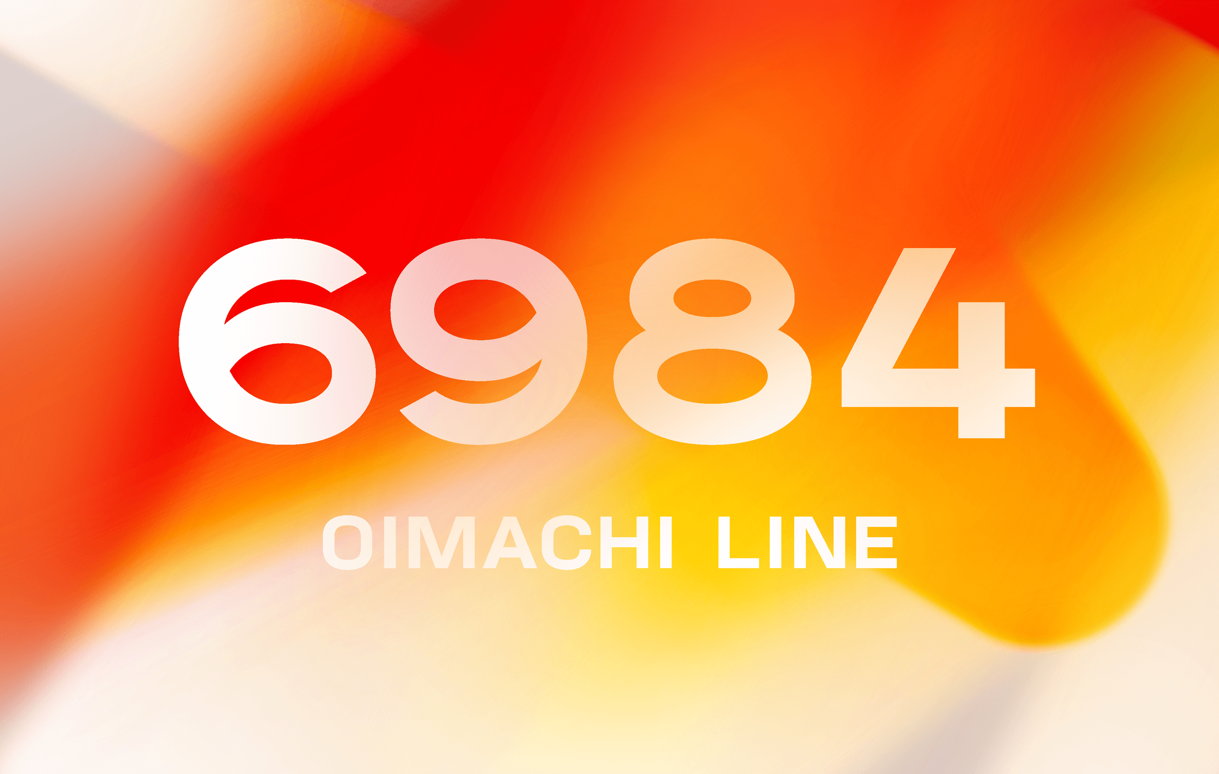
Oimachi
On a train line I frequently commuted, I’d often see old handpainted numbers inside and on the front of trains always caught my eye. Oimachi is an exercise in expanding those few characters, into a full set.
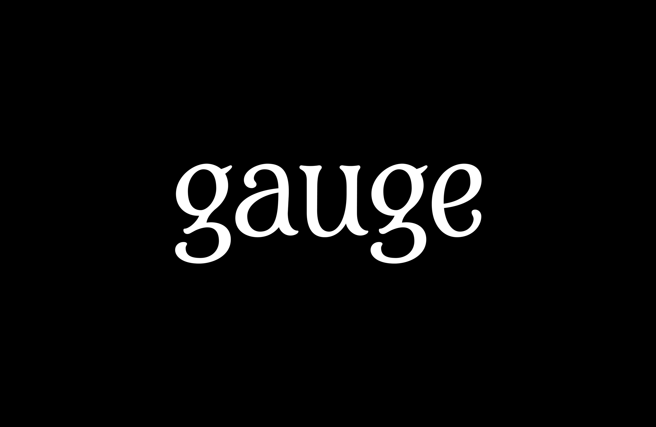
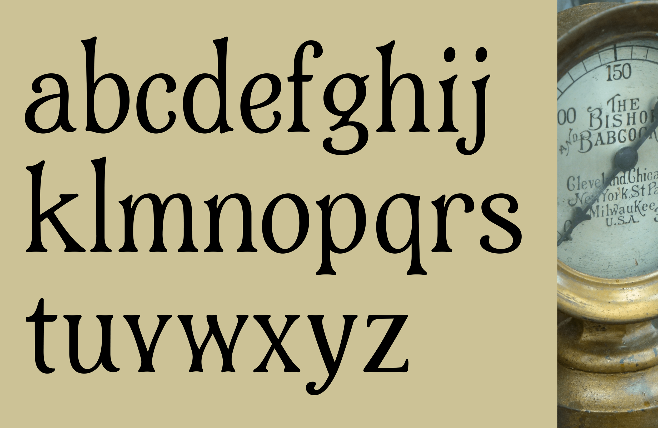
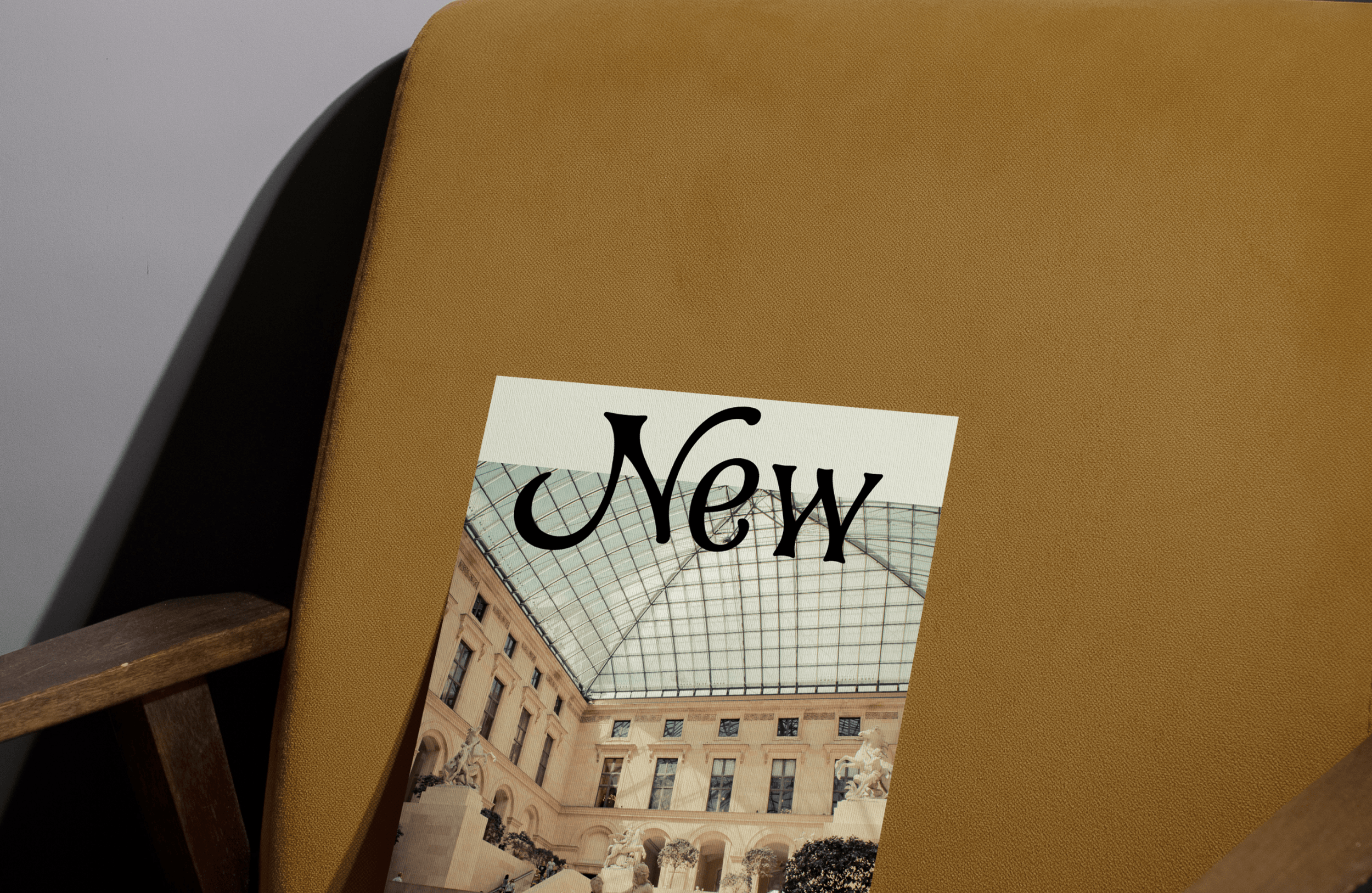
Gauge
I came across a photo of a classic Bishop and Barcock Co. gauge that had some very expressive hand painted characters, and translating the flair that comes with a human touch into digital type is a challenge that tests my ability to find good balance.